When Modernism Goes Bad - The Milwaukee Amtrak Station
ArchitectureChicago Plus posting from October 19, 2005
|
|||||
|
When Modernism Goes Bad - The Milwaukee Amtrak Station
|
|||||
|
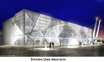
Late in his life, Mies van der Rohe was asked to describe his typical day. "I get up," Mies replied. "I sit on the bed. I think, 'what the hell went wrong? We showed them what to do.'" It's doubtful he had Milwaukee in mind when he said this, but that city's 1965 Amtrak station is a perfect demonstration of how the principles of modernism could be hijacked by the less talented to create an often dreadful work of architecture. The station sits just south of downtown, just beyond the East-West Freeway, a highway raised up into the stratosphere on stilts, slashing through the center of the The Milwaukee Journal's architecture critic Whitney Gould talks of the Amtrak station, designed by Daniel Grieb, as having a "Jetsons-style" modernism. The latest, $15,200,000 rehab proposal for the station, from Eppstein Uhen Architects, rips out the current front elevation of the structure, takes it another 30 feet towards the street, and creates a soaring atrium waiting area.
Gould is quick to dismiss the entire station, calling the bell tower "kitschy," yet there's a certain frozen-in-time grace to the classical-modernist arcade, which, No, where the 1965 Amtrak station goes wrong is by violating what is perhaps the most fundamental principle of modernism: a clear and consistent relationship between form and plan. The station is "bait-and-switch" architecture. The arcade is a classic (and classical) false front that has next to nothing to do with the building behind it. The arcade is open and airy, the spaces behind it are cramped and graceless. The building presents an object lesson of how to use the basic vocabulary of modernism in a cut-and-paste fashion that completely undermines its values. The ill-proportioned interior combines ticketing counters and waiting room in a sweeping expanse of space that manages to feel constricted and confining. There's a continuous drop ceiling with the fluorescent fixtures mounted below it in an erratic , disconcerting pattern. The arcade just outside may have generously spaced openings, but the waiting room itself offers only strip windows so thin that you'd think they charged a premium for daylight, separated by walls covered in small ceramic tiles of the type usually only found in public restrooms.
Still, if it wouldn't require the continuing torture of the good people of Milwaukee, I'd actually consider keeping the original station around as a kind of shrine of aversionial therapy. If Mies's buildings "show them how do it", architects everywhere could come to the stinker of St. Paul Street to learn how not to.
© Copyright 20052006 Lynn Becker All rights reserved. |
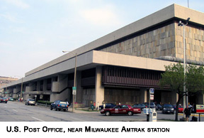 city like a raised, ugly scar that makes the buildings below look like a toy village placed beneath a Christmas tree. The station makes up half of a mini-museum of discredited 60's styles, sharing the street with a two-block-long, brutalist
 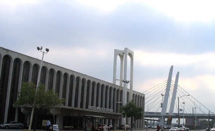 It's a very handsome, open, light-filled design, but forgive me if, as an interloper from Chicago, I express a certain fondness for the original street elevation, consisting of a long arcade of columns of white-painted steel topped off with a continuous, flat cornice of rounded arches. Near its western edge, a 125-foot-tall bell tower housing, not bells, but an electronic chiming device, is inserted onto the facade like a giant paper clip. The entire building has suffered from a scandalous lack of maintenance which has left the inner facings of many of the columns a pocked mass of rust stains.
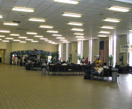 along with the bell tower, complements rather handsomely the geometry of the new
 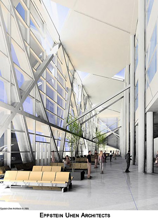 The Eppstein Uhen design, is obviously a major improvement, one that uses today's technology to create a space that is generous, open and filled with light.